


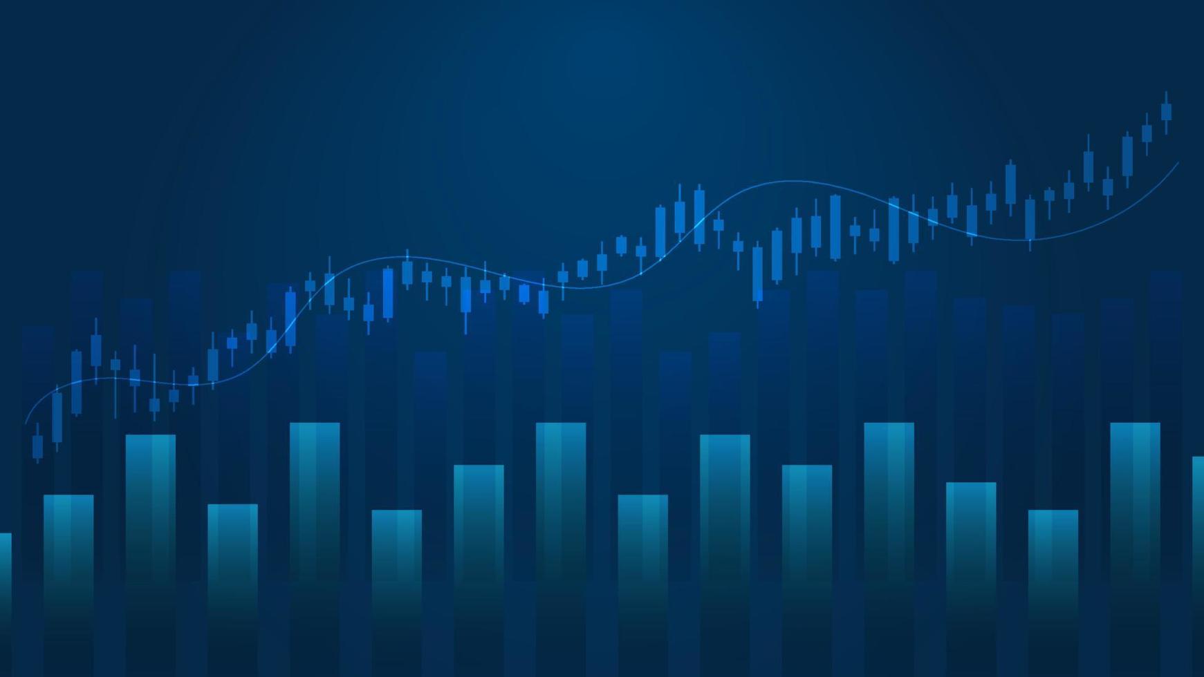
Bar Chart vs Candlestick Comparison Guide
MarketDash Editorial Team
Author
Traders rely on precise charting to read price action and identify key trends, using the distinct benefits of bar and candlestick charts to inform decisions. Each chart type displays open, high, low, and close prices differently, which affects how quickly market patterns are recognized and how trading opportunities are timed. Advanced techniques such as AI Stock Technical Analysis can further refine these insights by streamlining the evaluation process.
Visual cues from both chart designs help pinpoint trend reversals, continuation patterns, and volume changes essential to a successful trading strategy. Intelligent analysis minimizes the need to switch between multiple tools, ensuring trade signals are identified quickly and accurately. MarketDash’s market analysis platform provides clear visuals and real-time insights to support data-driven trading strategies.
Summary
- Bar and candlestick charts display the same price data (open, high, low, close), but they optimize for different cognitive priorities. Bar charts emphasize structural clarity through neutral vertical lines with tick marks, making them ideal for mapping long-term support zones, trend channels, and multi-quarter patterns without visual distraction. Candlesticks compress sentiment into color-coded bodies and wicks, allowing traders to interpret momentum shifts and rejection patterns instantly rather than manually calculating tick positions. The format you choose shapes which patterns you notice first and how quickly you can act when opportunities appear.
- Day traders and scalpers operating on sub-hour timeframes overwhelmingly prefer candlesticks because they make dozens of decisions per session based on momentum shifts that unfold across minutes. Over 80% of traders use technical analysis tools according to industry research, and the speed at which you interpret those tools directly impacts execution quality when milliseconds separate ideal entries from chasing momentum. The format's ability to surface sentiment changes across body size and color without requiring manual comparison enables monitoring multiple positions and scanning for new setups simultaneously.
- Position traders holding for weeks or months extract more value from bar charts because they filter out noise rather than react to it. When you're building multi-month trend channels or confirming whether ranges expand in the direction of a prevailing move, colored candlestick bodies that emphasize individual session battles become visual distractions from the structural boundaries that actually matter at that scale. The neutral format forces objective evaluation of tick positions and range relationships, leading to more reliable pattern validation when testing new strategies or backtesting historical setups.
- Japanese candlestick patterns such as hammers, engulfing formations, and doji rely entirely on the visual relationship between the open, close, and wicks within a single period. These sentiment-driven reversals lose interpretive power on bar charts because traders must manually compare tick positions rather than reading body size and wick length at a glance. Western technical patterns such as triangles and head-and-shoulders formations are more clearly visible on bar charts because the format highlights how price ranges stack and where highs and lows converge over extended periods.
- Strong setups often require cross-format validation to separate reliable signals from visual artifacts created by color emphasis and body size. Traders who spot potential reversals on candlesticks, then switch to bar charts to confirm structural elements that support the same conclusion, create a two-layer filter that captures higher-probability opportunities while rejecting noise. This workflow combines the perceptual speed of candlesticks with the structural objectivity of bars, improving signal quality without sacrificing the pattern recognition advantages that make candlesticks dominant for initial scanning.
- MarketDash's market analysis combines flexible chart visualization with AI-powered pattern detection that works across both bar and candlestick formats, highlighting high-probability setups as they form at key structural levels backed by volume confirmation and trend context.
What is a Bar Chart, and How Does It Work?

A bar chart shows price movement over specific time periods, using vertical bars that represent four critical data points: open, high, low, and close. Each bar serves as a visual record of where the price started, how far it moved in both directions, and where it ended at the end of the period. This format removes extraneous details and focuses solely on the facts needed to determine whether buyers or sellers controlled the session.
The design idea behind bar charts focuses on information density instead of visual storytelling. It displays more data on screen without clutter, which is helpful when comparing time frames or identifying patterns over weeks or months. The format doesn’t try to explain momentum; instead, it presents the range, with the opening price on the left and the closing price on the right.
This allows viewers to draw their own conclusions based on how these points are compared. For a deeper understanding of price movements, check out our market analysis features.
The main vertical line goes from the lowest price reached during the interval to the highest. This range indicates the level of volatility. A tall bar indicates active disagreement between buyers and sellers, wide swings in confidence, or strong pressure that pushed the price through different levels before settling. A short bar suggests calm, narrow trading, with neither side gaining much ground. When you see bars getting smaller after a period of bigger bars, you're watching the market pause, often before the next big move.
The extremes at the top and bottom of each bar show rejection zones. If the price rose but closed well below that peak, it indicates sellers stepped in and pushed back. On the other hand, if the price dropped to a low but recovered to close near the top, it indicates buyers defended that level and regained control. These rejection points become important markers for future sessions, as price often returns to test whether those zones still hold or break.
How do opening and closing prices influence interpretation?
The small horizontal tick on the left side of the bar shows the opening price, while the tick on the right indicates the period's closing price. If the right tick is above the left one, it means buyers gained ground during that time. If it is below, sellers were in control. The distance between these ticks, compared to the full range, shows whether the winning side dominated the entire session or just achieved a small victory after a lot of back-and-forth.
A close near the high with an open near the low suggests ongoing buying throughout the period. On the other hand, a close near the low with an open near the high indicates persistent selling.
When both ticks are clustered in the middle of the range, it means neither side won clearly. This indecision often happens before breakouts or reversals, when the market hasn't decided on its next direction.
What visual cues can help in analysis?
Many platforms use green or blue for bars where the close is higher than the previous close, and red for bars where it is lower. This optional layer speeds visual scanning without changing the underlying data. Traders can spot directional sequences more quickly and identify where momentum has shifted. They can also track whether recent closes are building on one another or moving in opposite directions.
Some traders prefer using neutral, single-color bars to avoid emotional bias. They focus solely on tick placement and range, rather than being influenced by color-driven sentiment cues.
How do bar charts aid in pattern recognition?
Bar charts excel at revealing Western technical patterns because they emphasize overall structure over individual period battles. Triangles, flags, head-and-shoulders formations, and breakout setups become easier to spot when visual noise drops.
You're looking at ranges stacking on top of each other, closing building sequences, and highs or lows forming boundaries. The minimalist design keeps your attention on those structural elements rather than the internal drama of each bar.
How do volume and other indicators enhance insights?
When combined with volume or moving averages, bar charts provide clear confirmation of a pattern's strength. A breakout bar with an extended range and high volume sends a different message than one with a narrow range and low activity. The format shows this difference without fancy visuals. By showing the range, close, and supporting data side by side, it becomes easier to distinguish genuine setups from false signals.
Why are bar charts beneficial for beginners?
The format offers a simple way for anyone new to technical analysis. Beginners focus on reading four data points and how they relate to one another, rather than on understanding complex visual symbols.
This simplicity greatly lowers the learning curve and helps build confidence faster. Once they grasp how open, high, low, and close interact, they can use that knowledge for any asset class or timeframe without needing to learn a new visual language.
What features enhance clarity in bar chart platforms?
Platforms like MarketDash understand that clarity is more important than complexity when making investment choices. Instead of needing to learn every charting style, they combine bar and candlestick views with smart AI pattern recognition that highlights key signals in real time. This gives structural clarity through bar charts and smart analysis that finds trend reversals, continuation patterns, and volume confirmation. These features help reduce information overload, allowing users to focus on setups that match their strategies.
How do bar charts maintain readability across screens?
The compact design allows more bars to fit on the screen without compromising readability. When viewing daily, weekly, and monthly charts side by side, this efficiency is critical.
Users can see how short-term changes relate to longer-term trends, identify where ranges align across timeframes, and assess whether a signal in one interval remains strong when viewed in a wider context. This simple format helps prevent visual tiredness, making it easier to scan many perspectives before deciding on a position.
How do bars impact trend-following strategies?
Bar charts highlight close-to-close relationships. This helps trend-following strategies stay focused on directional continuity instead of intraperiod noise.
When you hold positions for weeks or months, it's important to know where each session closed relative to the previous one. This information is more useful than the fluctuations that occurred during each session. The bar chart format keeps this focus clear, reducing the urge to overreact to temporary spikes or dips that don't change the overall trend.
What else should you consider about bar charts?
Understanding how bars display price action is only half the story when choosing a main charting method.
Related Reading
- AI Stock Technical Analysis
- What is Automated Trading
- What is Backtesting in Trading
- How To Use the Fib Retracement Tool
- Do Hedge Funds Use Technical Analysis
- What is SMA in Stocks
- Fundamental Analysis vs Technical Analysis
- How to Do Technical Analysis of Stocks
- How to Read Stocks
- Day Trading Patterns
- Moving Average Crossover Strategy
- How to Analyze a Stock Before Investing
- Volume Technical Analysis
- Double Top Chart Pattern
- Quantitative Stock Analysis
What is a Candlestick, and How Does It Work?
-400x300.png)
A candlestick chart displays the same four price points as a bar chart (open, high, low, close) and highlights the relationship between opening and closing prices with a colored body. The body’s color quickly shows the direction, green when the close is higher than the open, and red when it is lower.
Thin lines, called wicks or shadows, extend from the body to show how far the price went in either direction before coming back, revealing moments when prices were rejected or couldn't hold steady. For further insights on conducting effective market analysis, consider using MarketDash, which streamlines the process.
The format originated in 18th-century Japan, where rice merchant Munehisa Homma tracked futures prices and observed that traders' emotions influenced price movements as much as supply and demand. He created a charting method to emphasize these psychological struggles. This method set the foundation for modern candlestick analysis.
Although the method stayed within Japan for hundreds of years, analyst Steve Nison brought it to Western traders in 1991. It quickly became the primary chart type across most platforms because it could reveal shifts in sentiment over specific time periods.
How do body sizes indicate market sentiment?
The rectangular body stretches between the opening and closing prices, creating an immediate visual hierarchy. A tall body signals strong conviction: buyers or sellers controlled the session from start to finish with minimal pushback. A short body indicates indecision, with neither side gaining much ground despite the time elapsed. When you scan a chart and see bodies shrinking after a sustained move, you're watching momentum fade before the market commits to its next direction.
The body size relative to the full range indicates whether the winning side faced resistance. A long green body that takes up most of the bar's vertical space means buyers dominate without serious challenge. In contrast, a short green body with long wicks above and below suggests that buyers won, but only after significant back-and-forth. This internal struggle often precedes reversals, as it signals the current trend losing its ability to overcome opposition.
What do the wicks tell us about market dynamics?
The thin lines extending from the body indicate the session's highest and lowest prices before the price moves back. A long upper wick after a price increase indicates sellers were very active at higher prices, preventing buyers from pushing the price even higher.
On the other hand, a long lower wick after a price drop indicates that buyers stepped in to defend that area, reducing selling pressure and taking back control. These rejection levels are important because the price often returns to test whether those areas still hold or finally break.
Wicks also expose failed breakouts. When the price rises above a known resistance level but then closes below it, the upper wick indicates a failure.
Traders who bought when the price broke out are losing money, and their exits in subsequent sessions can accelerate the price reversal. The same pattern happens at support; a long lower wick below an important level, followed by a close above that level, traps sellers and helps push the price higher.
How do candlestick sequences impact analysis?
The clear visual difference between green and red bodies allows you to quickly scan multiple periods. This helps you identify periods when one side was stronger or when control shifted suddenly.
A series of green candles with small wicks indicates sustained buying pressure. On the other hand, a sudden red candle with a long body afterward might indicate an exhaustion point. You don't need to read tick positions or manually compare closes; the color change handles that.
This speed is important when monitoring multiple assets or timeframes simultaneously. Using color coding helps your brain focus, allowing traders to pay attention to larger patterns, such as support retests, trend channel limits, or volume differences.
Some traders prefer a single neutral color to avoid emotional bias, but most believe the benefits of greater efficiency outweigh the risk of misreading sentiment signals.
What are common candlestick formations and their meanings?
Individual candlesticks combine into recognizable formations that hint at upcoming reversals or continuations. A doji, with a tiny body and long wicks, follows a strong move and signals indecision: neither buyers nor sellers can maintain control, often preceding a directional change.
A hammer with a small body at the top and a long lower wick at a support zone indicates that buyers defended that level strongly, possibly marking a bottom. An engulfing pattern, where one candle's body completely covers the previous candle's body in the opposite direction, signals a strong shift in control.
These patterns work because they capture shifts in market psychology at decision points. When a doji appears after weeks of steady gains, it signals that the buying pressure sustaining the trend has stopped. On the other hand, when a hammer forms at a known support level, it confirms that this zone is still important enough for participants to reverse the decline. The visual clarity of candlesticks makes these psychological turning points easier to see than on a bar chart, where the same data is present but harder to interpret.
How do traders avoid common candlestick pitfalls?
Clean textbook candlestick patterns rarely show up in real trading. Actual charts have messy sequences where patterns overlap, incomplete shapes, and false signals mix with valid setups.
A common frustration happens when traders memorize pattern graphics and expect to find them easily. They soon learn that identifying a hammer or engulfing candle in context requires filtering out dozens of other candlesticks that almost fit the definition but lack confirming factors, such as volume or placement near key levels.
Reversal patterns, especially, can lead to lost accounts more than any other setup for beginners. Spotting a hammer at what appears to be a bottom and jumping in long without confirming the broader trend or checking whether that level matches structural support often leads traders to catch a falling knife.
The pattern itself does not fail; the context does. Candlesticks show shifts in sentiment, but they do not indicate whether such a shift has enough strength to sustain a new direction or is merely a brief pause before the previous trend resumes.
What role do candlesticks play when confirming trades?
Most traders eventually learn to use candlesticks as confirmation tools instead of standalone signals. They find a possible setup by looking at structure, like support, resistance, and trendlines, and then wait for a candlestick pattern at that level to confirm the expected reaction. This process helps reduce false entries by combining structural logic with sentiment evidence rather than relying solely on pattern recognition.
Platforms like MarketDash close this gap by adding AI-powered pattern recognition to candlestick charts. These platforms identify high-probability setups that align with volume trends, structural levels, and the broader market context. Instead of memorizing many formations and trying to see them in messy real-time data, traders get intelligent analysis that cuts through the noise and shows the patterns that really matter. This new approach shortens the learning curve from months of trial and error to immediate actionable insights.
How does the timeframe influence candlestick interpretation?
The same candlestick pattern carries different significance depending on when it appears. A hammer on a five-minute chart might indicate a quick bounce within a larger downtrend. But a hammer on a daily chart at a multi-month support level suggests a major reversal.
Looking at different timeframes helps confirm whether a signal in one timeframe aligns with the structure on higher timeframes. This can increase the chances that the setup will follow through.
When a bullish engulfing pattern appears on a daily chart, looking at the weekly view shows whether it formed at the lower edge of a rising channel. This creates a match: the short-term sentiment shift aligns with longer-term support. This combination provides greater conviction than a pattern that stands alone.
Candlesticks are well-suited to cross-timeframe analysis because their visual layout remains consistent across time intervals. This makes it easier to spot alignment or divergence without recalculating tick positions or range relationships.
What context is necessary for candlestick analysis?
A long green candle looks bullish on its own; however, if it forms after a multi-week rally and closes just below a known resistance level with declining volume, it is more likely a trap than a continuation signal. Even though the candlestick shows buying pressure, the context around it, such as overextended trends, resistance above, and weak participation, suggests that this pressure may not last. Traders who enter based only on how the candle looks often get stopped out when the market reverses in the next session.
Context is important for understanding what a candlestick means. Comparing the current candlestick to recent highs, lows, and key levels gives valuable insights. For example, if a hammer appears at a price level that has acted as support multiple times before, it is more significant than a hammer made in the middle of a range with no importance.
Likewise, if a doji forms after a sharp move that pushes the price far from its moving average, it signals exhaustion. On the other hand, the same doji in a consolidation zone indicates indecision without suggesting direction.
When should we wait for further confirmation?
Knowing when to trust a candlestick pattern versus when to wait for more confirmation depends on understanding how these visual tools work in different trading situations.
Bar Chart vs Candlestick

The difference between these two formats isn’t about which one shows better data; both show the same information. The real difference lies in how quickly you can extract actionable insights from that data when making decisions under pressure. Bar charts make you compare tick positions and figure out relationships manually, while candlesticks show those relationships immediately through color and body size. This cuts the cognitive work in half.
This speed advantage becomes especially important when evaluating multiple opportunities simultaneously or working under tight deadlines, where seconds can mean the difference between catching a setup and missing it entirely. A trader reviewing fifty stocks before the market opens needs to identify momentum shifts, exhaustion signals, and structural breaks without straining at the tick marks.
The format that reveals these patterns faster wins, not because it is more accurate, but because it lets you act on that accuracy before the opportunity disappears.
Which format is better for long-term analysis?
Bar charts deliver unmatched clarity when building structural analysis over long periods. When reviewing support and resistance zones from six months of daily data, or identifying trend channel boundaries spanning several quarters, clean vertical lines help focus on where highs and lows cluster. This method minimizes distractions from color changes that usually draw attention to individual session battles, which are unimportant at that scale.
The format also reduces interpretation bias. When testing a new strategy or backtesting old setups, neutral bars obscure patterns driven solely by emotional stories created by red and green bodies. This objectivity forces a review of tick positions and range relationships, leading to more reliable pattern validation. Experienced analysts often switch to bar charts to check if a setup seen on candlesticks holds up under neutral scrutiny.
Long-term position traders gain from this structural focus. When keeping positions for weeks or months, the details of each daily session become just noise. The key factors are whether each close builds on the last, whether ranges are widening or narrowing, and whether key levels hold or break. Bar charts keep that macro view in focus, helping to avoid overreactions to temporary intraday drama shown in candlestick wicks and body changes.
How do candlesticks improve short-term trading?
Candlesticks help identify patterns more quickly by showing changes in sentiment before we consciously notice them. Our brain sees a sudden red body after several green ones, faster than it realizes the close dropped below the last close.
This quick way of seeing is very important when monitoring multiple positions or when looking for signals to enter trades on a watchlist, since charts are not read sequentially. Instead, they are viewed together, and anything that makes each chart easier to understand significantly improves scanning effectiveness.
Moreover, this format shows small changes in momentum that bar charts make harder to spot. A shrinking body size after a strong move shows weak conviction, even if the direction hasn’t changed yet.
Also, a series of small bodies with long wicks in both directions shows a market in balance, likely to break hard when that balance changes. These early warning signs are easy to see on candlesticks but require careful comparison on bar charts, where tick distances and range ratios must be measured manually.
Short-term traders rely on this visual efficiency because their advantage often comes from seeing changes just before others react. For example, when a hammer forms at a known support level with a long lower wick, it shows rejection and recovery at a glance.
In contrast, a bar chart requires noting the low tick, comparing it to the close, and confirming that the open is near the high to reach the same conclusion. That extra processing time might only take seconds, but in fast markets, those seconds can decide whether a perfect entry price is found or whether one is chasing a move that has already begun.
What are the benefits of using both formats?
Many platforms lack candlestick charting, forcing traders to use workarounds that slow their analysis. Users want this feature because they see how much faster they can analyze price movements when the chart does the interpreting for them. Not having this tool isn't just a minor issue; it's a significant disadvantage that affects every decision. This situation turns what should be quick pattern recognition into a manual calculation that is repeated with each session.
Platforms like MarketDash fill this gap by combining candlestick charts with AI-powered pattern recognition. This clever approach shows high-probability setups as they happen. Instead of looking through charts manually and hoping to catch a hammer or engulfing pattern before it’s too late, traders get smart alerts that highlight these patterns at important structural levels.
This feature is supported by volume confirmation and trend context. Such improvements cut through the visual noise and information overload that most charting platforms create, providing precision when it's needed without requiring users to become pattern-recognition experts first.
Which chart format suits your trading style?
The trading timeframe determines which format works best. For those looking at weekly or monthly charts to spot long-term trends for position sizing or portfolio allocation, bar charts give the structural clarity needed.
They remove distractions from short-term sentiment changes that won't affect the overall idea. This clear format allows traders to focus on whether the trend remains unchanged, whether ranges are expanding in the direction of the move, and whether key levels are still holding.
Swing traders who work with daily or four-hour charts find candlesticks more useful because they base their decisions on patterns over several days, where single-session sentiment is very important. A daily hammer at support means more when the long lower wick shows a failed breakdown attempt. This visual confirmation strengthens the trade setup in ways that a bar chart's tick positions don't show as quickly.
Day traders and scalpers using sub-hour timeframes almost all prefer candlesticks. They make many decisions during each session based on momentum changes that happen within minutes.
The format’s ability to show these shifts through color and body size, without requiring extensive manual analysis, allows traders to follow multiple positions and opportunities simultaneously. While bar charts present the same data, the extra mental effort required to interpret each bar can lead to decision fatigue, which may hurt performance over a full trading day.
How can different formats confirm trading setups?
The strongest setups often appear when both formats align. If you see a potential reversal pattern on a candlestick chart, switching to bars and confirming that the structural elements (tick positions, range relationships, closing price relative to prior closes) support the same conclusion adds validation that the pattern isn't just a visual trick of color and body emphasis. This cross-format confirmation reduces false positives by verifying that the setup holds up under both interpretive and neutral analyses.
Many traders keep both chart types open simultaneously on separate monitors. They use candlesticks for real-time scanning and bars for structural verification before entering positions. This workflow combines the speed benefits of candlesticks with the objectivity of bars, creating a two-layer filter that captures more reliable setups while reducing noise. While this approach requires more screen space and a slightly more complex workflow, the improvement in signal quality often justifies the added complexity, especially for traders managing larger accounts, where each false signal has a meaningful cost.
What is the key takeaway about chart formats?
The format chosen shapes perceptions of the market, influencing which patterns are noticed first and, ultimately, which opportunities are acted upon. Neither format is better than the other; they work best for different priorities: structural clarity versus sentiment speed, long-term objectivity versus short-term pattern recognition, and neutral analysis versus interpretive efficiency. The right choice depends entirely on personal trading styles, the timeframes focused on, and whether an edge comes from spotting structural breaks or reading momentum shifts.
Understanding these differences is only helpful if one knows how to use them when trading decisions are on the line.
Related Reading
- AI Quantitative Trading
- AI Swing Trading
- Stock Sentiment Analysis
- Penny Stock Analysis
- Volume Analysis Trading
- How to Find Stocks to Day Trade
- How to Scan Stocks for Swing Trading
- Best Stock Trading Strategies
- Best Indicators for Day Trading
- Technical Analysis Trading Strategies
- Best Stock Indicators for Swing Trading
- Trading Exit Strategies
Which is Better for Technical Analysis?

Neither format delivers better technical analysis. Both show the same price data and support all the classic patterns, indicators, and structural levels used to build a trading thesis. The main question is not which one works better, but which one aligns with how you process information when making decisions.
For example, if you are looking at dozens of charts before the market opens to find setups that meet certain criteria, candlesticks help you see momentum exhaustion, rejection wicks, and sentiment shifts more quickly.
This is because the visual encoding does some of the thinking for you, so your brain doesn't have to do it all by itself.
On the other hand, if you are creating multi-month trend channels or mapping support clusters over longer timeframes, bar charts help you focus on structural boundaries without being distracted by the individual-session battles shown by colored bodies.
How do day traders benefit from candlesticks?
Day traders working in compressed timeframes need quick pattern recognition because their advantage can disappear in seconds.
Keeping track of five positions simultaneously while looking for new entries means every moment spent determining whether a price closed higher than it opened or whether the range expanded compared to the last period costs them opportunities.
Candlesticks simplify this mental effort. They use color and body size to help traders view charts at a glance rather than one at a time. According to the AimyTrade Blog, over 80% of traders use technical analysis tools.
The speed at which these tools can be understood directly affects how well they can execute trades. Just milliseconds can be the difference between a perfect entry and chasing momentum.
What do position traders prefer?
Position traders, who keep their trades for weeks or months, get more value from bar charts because these charts filter out market noise instead of reacting to it. At this scale, what matters is not whether buyers or sellers win a particular session, but whether each close builds on the previous one and whether key levels hold up under pressure.
The neutral format helps traders avoid emotional biases around red and green that could affect their trading plan. Instead, they concentrate on structure rather than feelings, and the clearer visual field keeps their focus on what is truly important.
Which patterns appear clearer on bar charts?
Western technical patterns like triangles, channels, and head-and-shoulders formations are easier to see on bar charts. This format highlights the overall structure instead of focusing on the ups and downs in each period. Traders look at how ranges are arranged, where the highs and lows converge, and whether breakouts show real strength by extending to larger ranges and higher volume.
On the other hand, candlestick bodies can obscure these boundaries when viewing months of data simultaneously. This can turn clear trendlines into visual estimates that require constant adjustment.
How do Japanese candlestick patterns differ?
Japanese candlestick patterns such as hammers, engulfing formations, and doji depend entirely on how the open, close, and wicks relate within a single time period. These patterns lose their meaning on bar charts; traders must manually check tick positions rather than quickly assessing body size and wick length.
If your strategy is to identify sentiment-driven reversals at key levels, candlesticks offer advantages. They are not only faster but also the only practical format for real-time use.
What is cross-format validation?
Strong setups often need cross-format validation. For example, you might see a potential reversal on candlesticks, and then switch to bars to confirm that the important parts support the same idea.
This two-step check identifies setups where the body colors and sizes create patterns that don't hold up to an unbiased review. Even though this extra step takes only seconds, it eliminates false signals that can waste money and erode confidence.
How do traders use both formats?
Some traders keep both formats on separate monitors. They use candlesticks for scanning and bars for verification before depositing funds. This workflow combines speed with objectivity, creating a quality filter that improves signal reliability without sacrificing the perceptual benefits that make candlesticks effective for spotting patterns at first glance. This approach requires more screen space and is slightly more complex to execute.
However, the increase in win rate often makes the extra effort worthwhile, especially for accounts where each false entry incurs high costs.
How do technical indicators overlay?
Most technical indicators, such as moving averages, RSI, MACD, and Bollinger Bands, appear similar across both formats. These indicators are calculated from closing prices or price ranges and are not affected by how the chart displays the data.
The format you choose does not change whether a moving average crossover signals a trend shift or the RSI indicates oversold conditions. What changes is how easily you can see divergences between price action and indicator behavior when both are displayed on the screen simultaneously.
Why is divergence detection faster with candlesticks?
Candlesticks support divergence detection by allowing traders to quickly interpret sentiment direction through color. While monitoring indicator movement in another section, visual cues from candlestick patterns enable faster recognition. For example, when the price reaches a new high with smaller green bodies, but the RSI does not confirm it, the difference is clear at a glance.
In contrast, bar charts require comparing closing positions across several bars while also tracking the indicator, adding extra steps that slow down recognition.
How does volume analysis benefit from bar charts?
Volume analysis benefits from bar charts when looking at structural breakouts. A tall bar that shows a larger range breaking through resistance tells a clear story, especially when combined with volume expansion.
Candlesticks can make this understanding harder. If the body size doesn’t match the full range, it can create confusion about whether the breakout had conviction throughout or only at certain points.
What challenges do charting platforms pose?
Most charting platforms lock users into a single format, making it difficult to analyze data quickly. This problem is especially annoying when users need to switch views based on their evaluations. Such friction accumulates with every decision, turning what should be quick visual confirmations into manual comparisons repeated many times during a session.
MarketDash solves this by combining flexible chart visualization with AI-powered pattern detection. This feature works across both formats, showing high-probability setups as they develop, regardless of your preferred view. Instead of choosing between speed and structural clarity, users benefit from smart analysis that reveals key patterns while filtering out distractions. This helps reduce information overload, providing precise insights when decisions are most important.
Why do weekly and monthly charts favor bars?
Weekly and monthly charts favor bars because they are designed to show long-term trends. Here, the feelings about individual sessions don't matter as much.
The clean vertical lines help users identify support zones that last for several quarters, identify trend channel boundaries, and assess whether ranges are widening in the direction of the main move. This style reduces visual distractions from colored bodies that show battles, which are less important at that scale.
What do swing traders find valuable?
Swing traders often divide their chart preferences between four-hour and daily charts, based on their strategy. Traders building positions over several days find candlestick patterns very useful. These patterns help traders make smart choices based on multi-session sentiment, where each time frame adds to the overall belief in structural setups.
For example, a daily hammer at support becomes more important when accompanied by a long lower wick, indicating a failed breakdown attempt. This gives visual proof that strengthens their thesis.
What do sub-hour charts demand?
Sub-hour charts almost universally demand candlesticks because you're making dozens of decisions per session based on momentum shifts that unfold across minutes. This format clearly shows shifts in color and body size, so you don’t have to manually compare ticks. As a result, traders can track multiple positions and identify new opportunities simultaneously. While bar charts may present the same data, interpreting each bar requires more cognitive effort. This can lead to decision fatigue, which can hurt performance during a full trading session.
How does format choice impact decision-making?
The format chosen significantly influences the patterns recognized initially. It determines which setups are seen as trustworthy. Ultimately, it affects the opportunities taken, especially when capital is at stake.
Try our Market Analysis App for Free Today | Trusted by 1,000+ Investors
You've seen how bar charts and candlesticks each show price action differently. You've also learned how the time you choose and your strategy affect which format is better for you. Additionally, you know that the strongest analysis often comes from knowing when to switch between them.
The real challenge isn't just picking one format over the other. It's having both formats available, supported by smart tools that highlight high-probability setups before you spend hours manually reviewing charts.
MarketDash eliminates that struggle by merging flexible charting with AI-powered stock grading, real-time valuation scans, and hand-picked selections. These features connect technical signals with fundamental strength. Whether you like the clear structure of bar charts for long-term investing or the quick insights of candlesticks for swing trades, you get precision without being overwhelmed by difficult data.
Start your free trial today and see how much faster you can go from chart analysis to confident decisions when expert curation does the hard work for you.
Related Reading
- Stock Market Technical Indicators
- Tools Of Technical Analysis
- Tradingview Alternative
- Trendspider Vs Tradingview
- Ninjatrader Vs Tradingview
- Tradovate Vs Ninjatrader
- Ninjatrader Vs Thinkorswim
- Tradestation Vs Thinkorswim
- Tradestation Vs Ninjatrader
- Thinkorswim Vs Tradingview
Get Market News Alerts
Real-time alerts on price moves, news, and trading opportunities.
Join 20,000+ investors. No spam, ever.
Featured Articles
View all news
Chips Get Crushed, Oil Spikes on Strait Strike: Midday Market Chaos
Elon’s “Atlantic” Secret (Ad)

Amazon Is Borrowing $25 Billion to Build AI Stuff. Here's What That Means for the Stock.

Rivian's $1.7 Billion Stock Sale: A Necessary Evil or a Sign of Trouble?

SpaceX Hits the Nasdaq 100 Just 15 Days After Its Debut—But the Stock Is Already Slipping
Strange Elon Crates Spotted Near the Hoover Dam (Ad)

Why Oil Prices Are Rising Even as OPEC+ Adds Supply: It's All About Refineries